Monday, October 20, 2014

Single Staple Collage Chunkies


This chunky theme turned out to be more of a challenge than I imagined!  I have amassed quite a bit of ephemera from my travels to Italy (Bellagio, Venice, Florence and Rome).  I wanted to find a way to use them in these chunky pages.  With a single staple, however, composition proved to be difficult.  Think about it--each piece of ephemera had to be placed in such a way that one staple would have to pass through it to secure all pieces to the page.  If I wanted something to appear on the right side of the page but my staple was on the left side, I had to make sure I didn't trim that particular piece too short.  As an added challenge, I decorated both sides of my chunkies!

 The top photo shows the front sides and the bottom photo shows the back sides of my pages.  As painful as this challenge first was, I ended up really enjoying the process.  You can see how I created layers of images.  Some pieces fold out to reveal more hidden surprises.  As I glance over each of these pages, they bring back wonderful memories of beautiful Italy!

Sunday, October 12, 2014

Heroes and Villains


My villain of choice for this month's "Heroes & Villains" themed book was none other than Cruella De Vil.  She was one of the most memorable villainesses from my childhood.  I remember her as such an imposing figure--even amidst all 101 Dalmatians.  I just had to create a pop-up of Cruella for this spread.

This was a rather large book to work in and the pages had a glossy texture. I began by gessoing the pages and then added the black dalmatian spots to complete my background.  After selecting the image of Cruella that I wanted to feature, I created a simple v-fold and attached it to the base of my image.  I positioned her over the book's gutter and made sure she fit inside the book when it closed.

The rest of the spread is decorated with images of dalmatians cut out from books and mounted onto cardstock for added body.  I used foam adhesive for the dalmatian images to create a 3-D effect.  What a fun spread to make!

Thursday, October 2, 2014

Mind Games


As I pondered (agonized) over what to do in Hope's "Mind Games" book this month, I found myself drawn to the cryptic symbols and hidden messages Dan Brown wrote about in his book "The Da Vinci Code."  I am fascinated by the look of these ancient symbols and even more mystified by what they all mean.

My spread consists of a sample of mirror-image writing (left page background) as Da Vinci was known to write in this manner.  Alchemy symbols appear on the background of the right page.  I covered both pages with brown tissue to give it an aged, parchment paper kind of look.

The overlays are images printed on vellum and secured with eyelets and brads.  I used Da Vinci's Vitruvian Man on the left and embellished it with a little string art.  The hand image on the right is one of my favorites.  I embellished it with odds and ends I had in my stash.  

Finally, the text is stamped onto deli paper and adhered with matte medium.

Sunday, September 28, 2014

Steampunk Mona


This month's chunkies were all about Altered Mini Mona Lisas!  I tossed around a few other ideas before settling on Steampunk.

I had seen this embossed faux metal technique that I wanted to try.  For my backgrounds, I took a 4 x 4" piece of chipboard and covered both sides with metal tape.  I then placed the page into an embossing folder and ran it through my Big Shot.  Very cool!  I used a bunch of different embossing folders just to see what the different textures would look like.  So much fun!

Sticking with the Big Shot, I used my gear die and made lots of die cuts.  I used Mrs. Grossman's Scrap Metal sticker sheets to cover pieces of chipboard and ran those through the Big Shot to give the gears a metal patina.  I added metal gear embellishments to the centers and then secured gears of varying sizes with pieces of foam mounted adhesive for a 3-D effect.

To alter my mini Mona Lisas, I gave her steampunk goggles and placed a small metal key in her hand.  She wears a die-cut crown also made using chipboard covered with Mrs. Grossman's Scrap Metal sticker sheets.

Tuesday, August 12, 2014

Mystery Palette Challenge

Book Cover


I have been busy preparing my book for a new AB RR that will begin next month.  With a cover like this, how could I not pick a theme that had to do with COLOR?   My book is all about getting you out of your color comfort zone.  I call it the "Mystery Palette Challenge."

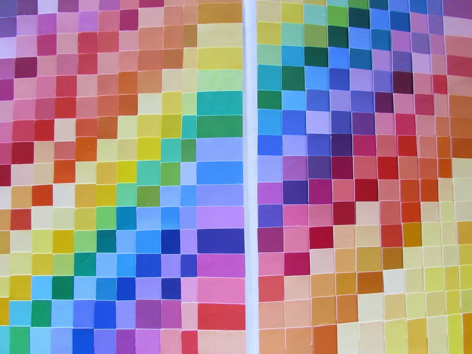
I started by decorating the inside covers (front and back) with literally hundreds of 1" squares punched out of paint chip samples.

Inside Front Cover

Inside Back Cover


The introduction page for my book was done with Dylusion Ink Sprays in the colors of the rainbow.  I just love how vibrant and bold the colors are!


Introduction Page

Instructions

The premise of my theme was inspired by the column entitled "With One Palette" featured in Somerset Studio Magazine.  I started by gathering 20 different color palettes. Then, for each palette, I punched 1" squares for each color from my never-ending supply of paint chips, and placed them into mini envelopes.  I sealed and numbered each envelope.  Hence, the "mystery."  The envelope will also serve as the  artist's sign-in.


Flag Pull-Out With Envelopes Attached


I decided to display the mystery palette envelopes in a flag pull-out.  Each envelope is attached with velcro which made the pull-out quite bulky.  Instead of attaching it to the book at the start of the round, I decided to keep the flag pull-out separate and will attach it to the front of my book at the conclusion of this round.

Each player will select one envelope and the challenge is to create a spread using just the colors (all of them) in the palette they selected.  For my initial spread, I chose the only palette that contained 5 colors.  Here they are:


Envelope (shown with palette) Doubles As Artist's Sign-In

I wanted to try my hand at melted crayon art using the 5 colors of my selected palette. I filled the blank spaces in with a little doodling.


Now my book is just about ready to be placed into the rotation.  I hope all of the artists will enjoy this Mystery Palette Challenge and maybe surprise themselves by creating beautiful works of art with a palette that is just a bit outside of their color comfort zone!

Monday, August 11, 2014

Out of An Orange Colored Sky


Inspiration for this month's chunky pages came quickly this time.  For "Inspired by a Song Title or Line" I chose a line from the Natalie Cole version of "Orange Colored Sky" that provides this great visual:

"...out of that orange colored, purple striped, pretty green polka dot sky..."

I started with glossy white cardstock (4" x 8" which would be folded in half to the 4" x 4" chunky page size) and gently blended alcohol ink for my background "orange" sky.  Next, I took a purple gelli pen and drew random lines for my "purple stripes."  Finally, I used lime green acrylic paint and applied my "polka dots" with a Q-tip and BBQ skewer sticks. 

To feature the line that inspired these pages, I remembered that I had these plastic orange slide frames!  I printed out the line from the song and centered them inside the frames.  I then made four slits to hold the frame and complete my pages.

So fun and so simple!!

Sunday, August 10, 2014

A Cult of Blue Oysters


So I'm scheduled to work in a book whose theme is "Astronomy" this month.  However, it's not astronomy in the usual sense of the word.  This book theme is inspired by the lyrics of a song entitled "Astronomy" by the band Blue Oyster Cult.

Kudos to the many of the artists that came before me who listened and studied the lyrics for inspiration.  I wanted to do something a bit different.  Initially, I thought about doing something linked to the band's album cover art, but I was stumped.

I think at times like this, going literal helps me push through the block.  In this case, I took the band's name and created a literal translation.  Blue Oyster Cult = A Cult of Blue Oysters!  Aha!  Now THAT, I could do!

I found a black & white sketch of oysters to use as my background.  I added a turquoise blue glaze to give it some color.  Then I printed out different images of more black & white oysters onto cardstock and also glazed them blue.  Then I glued several layers together before cutting each oyster out.  I placed the cut-out oysters on top of my background and secured them with glue dots to create a 3-D effect.  I added touches of glitter glue, well, just because.

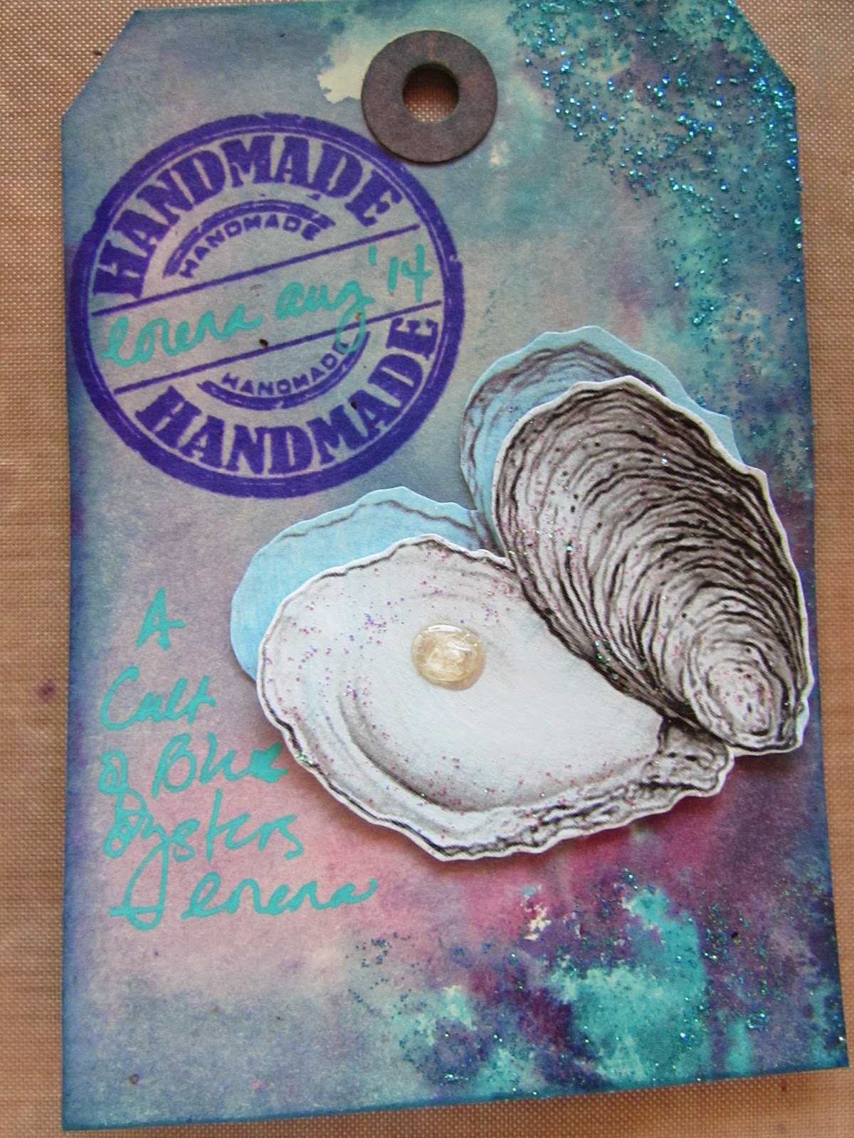
Of course, no oyster would be complete without a pearl or two (or 12!).  I used Liquid Pearls (what else?) to make my pearls and then topped each off with some Glossy Accents to give them a more life-like, spherical appearance.  I used an extra oyster to decorate my sign-in tag (bottom photo).

I apologize to Hope who did not wish to have too much bulk added to her book pages, but I just couldn't resist!