Monday, November 24, 2014

The Magic of Christmas...


We have come to the final round in the second Altered ladies Round Robin.  I was working in a "Magic" themed book.  As you would expect, all of the other spreads explored and focused on the occult and magician's tricks.  With the holidays now upon us, I took a slightly different take on this theme and went with "The Magic of Christmas..."

I knew I wanted to do an iris fold Christmas tree.  I found a simple pattern which I enlarged to fit the size of the book.  I used the pages that had been removed from the book and colored them with different hues of green for my iris fold papers.  To make it more interesting, I couldn't resist incorporating the November lesson in Lisa's Vollrath's Year of Altered Book class.  We are studying pop-ups this month and how I love pop-ups!!  What if I did a pop-up iris fold Christmas tree?   And, for fun, I took it up another level and created a double layer pop-up.  When the viewers open the book, they will see the iris fold Christmas tree through a window.

I loved the meditative exercise of creating an iris fold design.  While I have made a few pop-ups over the years, I really enjoyed learning about the construction and executing my very first double layer pop-up! 


Tuesday, November 4, 2014

Circle of Color


Pam's book invites you to select a palette from paint chips.  The catch here is you must select a color whose name begins with one or both of your initials.  I poured through many paint chips hoping that I would stumble across a color that I'd never used before that began with an "L" or a "G."  I was immediately drawn to a deep purple called "Love Letters" and a beautiful green called "Luau Green."

I considered doing a very literal interpretation for this book--purple love letters--but the visuals that I was coming up with did not excite me.  I should add that Pam's book is cut into a circular shape.  I knew that I would want my spread to compliment and work with that shape.  These two colors naturally lent themselves to a plant or flower.  Yes, a simple, but exquisite flower.

This is when I got the idea to create a pop-up lotus flower.  I had seen different variations of these pop-up flowers.  After some research, I found the technique I wanted to do.  This particular pop-up does not require any special paper.  I decided to use vellum which creates crisp creases but also has a delicate feel to it.  I used Seedless Preserves Distress Stain to color my lotus petals.  Applying the Distress Stain caused the vellum petals to curl, so I had to weight them down with a book so they would dry flat.  The background paper serves as my Luau Green.

I used 10 sheets of vellum to create this flower.  Once assembled, I think a heavier weight vellum would have given it more body.  This vellum was quite thin and the petals are a bit floppy, but they still stand up.  I just love the simplicity of the spread!

Single Staple Collage Chunkies


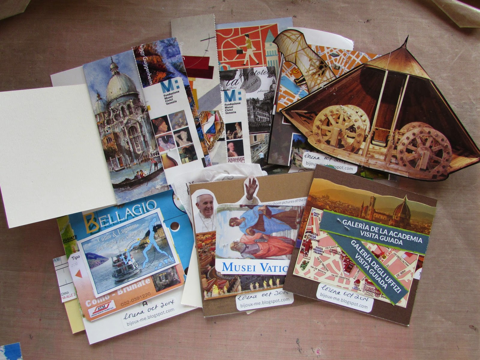
So the idea for this month's chunky challenge was to create a page using materials that are secured with just a single staple.  This seemed to be a rather simple technique, right?  As I got started, however, the most important thing I learned was to wait  until AFTER all the pieces were into (com)position before trimming them to size.  If you trim too early, you may not be able to secure all the pieces with a single staple.  So therein lies the challenge!

I used the various ephemera that I collected on my recent trips to Italy for my pages.  In 2010, we visited Lake Como, Bellagio and Venice.  This past June, I was back in Venice, then Florence, Tuscany (Montalcino) and Rome.  I managed to collect SO MUCH ephemera, that I wanted to use as much of it as possible in my pages.  For this reason, I challenged myself to decorate both front and back of the page.  Now when I look at my finished pages, each piece of paper reminds me of a museum, a restaurant, an Italian paper shop, a great gelato place, a ferry ride...I LOVE that!  And, it's a wonderful way to share some of the highlights of my travels with the other chunky players!

Monday, October 20, 2014

Art is Important...


I thought this book would be difficult to work in at first.  The theme "Why Art Is Important..." seemed so profound and difficult to express in visual form.  The spreads that came before me were deeply personal.  How would I tackle this theme?  As I thought about what I would do for this AB, I began to brainstorm the many things that art is or can be.   Through this exercise, it became clear to me that while art can sometimes be viewed in a negative light (controversial, offensive, provocative), ultimately art, in all its forms--allows us to grow in a multitude of ways including understanding, tolerance and community.  To illustrate this idea, I cut each of these thoughts about art into strips of paper shaped like blades of grass and filled the pages.  I must say that I really enjoyed spending time to reflect on the many ways art influences us.

Forgot to add that I was watching Kevin Costner in "Field of Dreams" as I cut out my blades of grass.  Coincidence?  I think not...

Single Staple Collage Chunkies


This chunky theme turned out to be more of a challenge than I imagined!  I have amassed quite a bit of ephemera from my travels to Italy (Bellagio, Venice, Florence and Rome).  I wanted to find a way to use them in these chunky pages.  With a single staple, however, composition proved to be difficult.  Think about it--each piece of ephemera had to be placed in such a way that one staple would have to pass through it to secure all pieces to the page.  If I wanted something to appear on the right side of the page but my staple was on the left side, I had to make sure I didn't trim that particular piece too short.  As an added challenge, I decorated both sides of my chunkies!

 The top photo shows the front sides and the bottom photo shows the back sides of my pages.  As painful as this challenge first was, I ended up really enjoying the process.  You can see how I created layers of images.  Some pieces fold out to reveal more hidden surprises.  As I glance over each of these pages, they bring back wonderful memories of beautiful Italy!

Sunday, October 12, 2014

Heroes and Villains


My villain of choice for this month's "Heroes & Villains" themed book was none other than Cruella De Vil.  She was one of the most memorable villainesses from my childhood.  I remember her as such an imposing figure--even amidst all 101 Dalmatians.  I just had to create a pop-up of Cruella for this spread.

This was a rather large book to work in and the pages had a glossy texture. I began by gessoing the pages and then added the black dalmatian spots to complete my background.  After selecting the image of Cruella that I wanted to feature, I created a simple v-fold and attached it to the base of my image.  I positioned her over the book's gutter and made sure she fit inside the book when it closed.

The rest of the spread is decorated with images of dalmatians cut out from books and mounted onto cardstock for added body.  I used foam adhesive for the dalmatian images to create a 3-D effect.  What a fun spread to make!

Thursday, October 2, 2014

Mind Games


As I pondered (agonized) over what to do in Hope's "Mind Games" book this month, I found myself drawn to the cryptic symbols and hidden messages Dan Brown wrote about in his book "The Da Vinci Code."  I am fascinated by the look of these ancient symbols and even more mystified by what they all mean.

My spread consists of a sample of mirror-image writing (left page background) as Da Vinci was known to write in this manner.  Alchemy symbols appear on the background of the right page.  I covered both pages with brown tissue to give it an aged, parchment paper kind of look.

The overlays are images printed on vellum and secured with eyelets and brads.  I used Da Vinci's Vitruvian Man on the left and embellished it with a little string art.  The hand image on the right is one of my favorites.  I embellished it with odds and ends I had in my stash.  

Finally, the text is stamped onto deli paper and adhered with matte medium.

Sunday, September 28, 2014

Steampunk Mona


This month's chunkies were all about Altered Mini Mona Lisas!  I tossed around a few other ideas before settling on Steampunk.

I had seen this embossed faux metal technique that I wanted to try.  For my backgrounds, I took a 4 x 4" piece of chipboard and covered both sides with metal tape.  I then placed the page into an embossing folder and ran it through my Big Shot.  Very cool!  I used a bunch of different embossing folders just to see what the different textures would look like.  So much fun!

Sticking with the Big Shot, I used my gear die and made lots of die cuts.  I used Mrs. Grossman's Scrap Metal sticker sheets to cover pieces of chipboard and ran those through the Big Shot to give the gears a metal patina.  I added metal gear embellishments to the centers and then secured gears of varying sizes with pieces of foam mounted adhesive for a 3-D effect.

To alter my mini Mona Lisas, I gave her steampunk goggles and placed a small metal key in her hand.  She wears a die-cut crown also made using chipboard covered with Mrs. Grossman's Scrap Metal sticker sheets.

Tuesday, August 12, 2014

Mystery Palette Challenge

Book Cover


I have been busy preparing my book for a new AB RR that will begin next month.  With a cover like this, how could I not pick a theme that had to do with COLOR?   My book is all about getting you out of your color comfort zone.  I call it the "Mystery Palette Challenge."

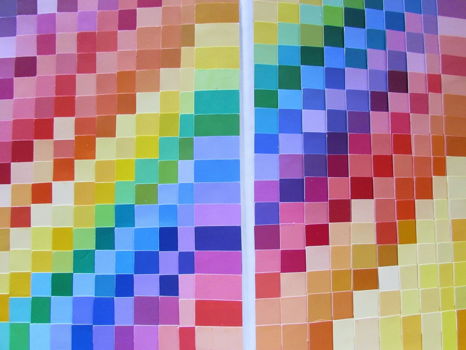
I started by decorating the inside covers (front and back) with literally hundreds of 1" squares punched out of paint chip samples.

Inside Front Cover

Inside Back Cover


The introduction page for my book was done with Dylusion Ink Sprays in the colors of the rainbow.  I just love how vibrant and bold the colors are!


Introduction Page

Instructions

The premise of my theme was inspired by the column entitled "With One Palette" featured in Somerset Studio Magazine.  I started by gathering 20 different color palettes. Then, for each palette, I punched 1" squares for each color from my never-ending supply of paint chips, and placed them into mini envelopes.  I sealed and numbered each envelope.  Hence, the "mystery."  The envelope will also serve as the  artist's sign-in.


Flag Pull-Out With Envelopes Attached


I decided to display the mystery palette envelopes in a flag pull-out.  Each envelope is attached with velcro which made the pull-out quite bulky.  Instead of attaching it to the book at the start of the round, I decided to keep the flag pull-out separate and will attach it to the front of my book at the conclusion of this round.

Each player will select one envelope and the challenge is to create a spread using just the colors (all of them) in the palette they selected.  For my initial spread, I chose the only palette that contained 5 colors.  Here they are:


Envelope (shown with palette) Doubles As Artist's Sign-In

I wanted to try my hand at melted crayon art using the 5 colors of my selected palette. I filled the blank spaces in with a little doodling.


Now my book is just about ready to be placed into the rotation.  I hope all of the artists will enjoy this Mystery Palette Challenge and maybe surprise themselves by creating beautiful works of art with a palette that is just a bit outside of their color comfort zone!

Monday, August 11, 2014

Out of An Orange Colored Sky


Inspiration for this month's chunky pages came quickly this time.  For "Inspired by a Song Title or Line" I chose a line from the Natalie Cole version of "Orange Colored Sky" that provides this great visual:

"...out of that orange colored, purple striped, pretty green polka dot sky..."

I started with glossy white cardstock (4" x 8" which would be folded in half to the 4" x 4" chunky page size) and gently blended alcohol ink for my background "orange" sky.  Next, I took a purple gelli pen and drew random lines for my "purple stripes."  Finally, I used lime green acrylic paint and applied my "polka dots" with a Q-tip and BBQ skewer sticks. 

To feature the line that inspired these pages, I remembered that I had these plastic orange slide frames!  I printed out the line from the song and centered them inside the frames.  I then made four slits to hold the frame and complete my pages.

So fun and so simple!!

Sunday, August 10, 2014

A Cult of Blue Oysters


So I'm scheduled to work in a book whose theme is "Astronomy" this month.  However, it's not astronomy in the usual sense of the word.  This book theme is inspired by the lyrics of a song entitled "Astronomy" by the band Blue Oyster Cult.

Kudos to the many of the artists that came before me who listened and studied the lyrics for inspiration.  I wanted to do something a bit different.  Initially, I thought about doing something linked to the band's album cover art, but I was stumped.

I think at times like this, going literal helps me push through the block.  In this case, I took the band's name and created a literal translation.  Blue Oyster Cult = A Cult of Blue Oysters!  Aha!  Now THAT, I could do!

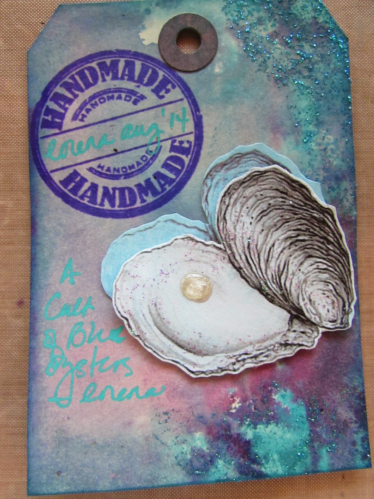
I found a black & white sketch of oysters to use as my background.  I added a turquoise blue glaze to give it some color.  Then I printed out different images of more black & white oysters onto cardstock and also glazed them blue.  Then I glued several layers together before cutting each oyster out.  I placed the cut-out oysters on top of my background and secured them with glue dots to create a 3-D effect.  I added touches of glitter glue, well, just because.

Of course, no oyster would be complete without a pearl or two (or 12!).  I used Liquid Pearls (what else?) to make my pearls and then topped each off with some Glossy Accents to give them a more life-like, spherical appearance.  I used an extra oyster to decorate my sign-in tag (bottom photo).

I apologize to Hope who did not wish to have too much bulk added to her book pages, but I just couldn't resist!

Tuesday, July 22, 2014

Wizard of Oz Redux


The Wizard of Oz is a popular theme and I have had the opportunity to work in several ABs over the years with this theme.  The challenge for me becomes how to keep the theme fresh and fun...I have done a spread on "Wicked."  I have done a black & white spread depicting the tornado scene.  I used the wishes of the characters to do a spread in a "Three Wishes" AB.  

The inspiration for my spread in Amanda's book this month came from the paint chip samples that I have been playing with for the past several months.  I initially created "inchies" from them for a chunky swap.  I had a lot of leftovers laying around and that's when this vision came to me.  I would do a paint chip rainbow as in "Somewhere Over the Rainbow."  That was so much fun to make.  The hardest part was trying to figure out what order to adhere the different shades of reds, oranges, yellows, greens, blues, indigos and violets (ROYGBIV).

I was very meticulous when I punched out a 1" square from each color chart.  I made sure to label the backs with a code so that I would not get confused which color went in what order.  I also grouped them into color classes to keep them in order.  I actually ended up using a 1/2" punch to create the squares for the rainbow because the 1" squares were too large.  

To make my yellow brick road, I took all of the yellow paint chips, cut out several sets of 1/2" squares and then cut them in half to make my bricks.  I then paved the bottom of the page with yellow bricks.

Dorothy and the two quotes you see here are from a greeting card that I cut up.  I decided to have Toto deliver the punchline.  I got an image of Toto from the internet.

The last picture is my sign-in tag for Amanda's book.  I embellished an image of the ruby red slippers with red glitter glue topped with red glitter.  I outlined the image with a yellow marker for brighter contrast and cut them out to create a tag.

Sunday, July 20, 2014

Postage Stamp People Chunkies


I had seen this idea of "postage stamp people" where you take a stamp with a picture of a head on it and create a body for it.  So for this month's chunky challenge, I changed this idea up a bit.  I took an image of a woman and used stamps to fill in her gown.  

For her gown, I glued a bunch of stamps onto cardstock and cut them out in the shape of her gown.  I ran the image off onto acetate to use as an overlay on the stamps.   My backgrounds are pages from a Bulgari jewelry catalog.  The acetate is secured with eyelets.  Voila!  My own take on the theme postage stamp people!

Thursday, June 26, 2014

Friendship


The challenge this month in Lisa Vollrath's Year of Altered Books class was to incorporate a pocket into your spread.  Once again, I used the monthly challenge as inspiration for an AB spread I am working in this month.  

Teri's "Friendship" theme got me thinking about a group of friends I have known since grade school.  Now, almost 50 years later, we still gather regularly--usually at a table, over a meal.  I cut out an image of stacked china from a Tiffany catalog and placed them onto a crocheted doily.  I embellished the plate borders with glitter glue.  I also cut out a silverware setting from another Tiffany catalog to use in this spread.  Finally, I used a tea bag wrapper as my "pocket" and created a tea bag-shaped vellum fold out with an explanation of my spread which tucks into the tea bag wrapper.

This book already had a half page cut away on the left side.  Rather than wasting that half page, I ran a wide piece of lace down the center on both sides of the page.  On the front, I placed a silverware setting.  When you open the half page (flap), it reveals a list of words that comes to mind when I think about this group of friends.  I aged the edges of the list with chalk ink to give it a more distressed/aged look which made it fit into the vintage-y feel of the spread.

No Paper Allowed Chunkies


This month's chunky challenge was not to use any paper in your pages.  I knew that fabric would be an obvious substitute, so I took the challenge a bit further and used screen, foil tape, safety pins and charms.
Here's a peek at my "No Paper Allowed" chunky pages. 


Tuesday, May 27, 2014

Openings & Closings

I do not sew.  So I can't explain why, when it came to working in this book (themed Openings & Closings), my mind immediately thought of zippers.  I did like the idea of zippers being able to open and close.  Then I decided that I wanted to be able to attach, detach and even re-attach the pages with zippers.  Okay, but what to do with the rest of the book pages?

Enter the idea of found poetry.  (Found poetry also happens to be a topic in this month's lessons in Lisa Vollrath's A Year of Altered Books class.  Coincidence?  I think not).  I decided to go through the words of the book pages and circle the words that related to "open" and "close."  Since this was a book on gardening, there were not many literal references.  I was forced to expand my definition of open and close in order to find enough words to make this piece work.  For open, I chose words like grow, bloom, window, illuminating, etc.  For close, there was dormancy, blind, cornered, nonblossoming.  You get the picture.

If you google found poetry or look on Pinterest, you will see a lot of doodling in and around the found poetry words.  This inspired me to take out my barely-used Micron pens and to try my hand at doodling for the very first time.  Don't laugh.  A friend recently gave me a Zenspirations book which gives step-by-step instructions on how to doodle which I found extremely helpful.

As you can see, the found poetry words got lost in the busy-ness of the doodles and other text on the page.  I felt that highlighting them would make them stand out more.  I used green highlighter for the "open" words and pink highlighter for the "close" words.

My spread begins with a two-page spread in the book itself.  I then took two loose pages and attached them to the pages in the book with separating zippers creating a four-page spread.  I then folded the two outer pages in toward the gutter of the book and attached a third zipper.  This is how the spread looks zipped closed:


This is how the spread looks when the center zipper is unzipped open to reveal the four-page spread inside:


This photo shows the two loose pages removed and re-attached to each other by zipper:


The loose pages really are interchangeable!  Right side, left side, front or back, you decide!


Close ups of the found poetry, doodling and highlighting: