Saturday, July 21, 2018

Speaking of Black Ice...


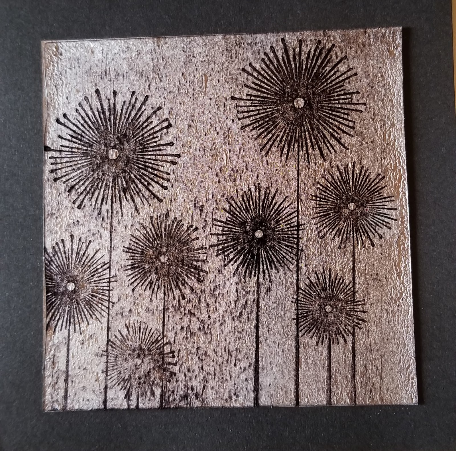
Since I had already been experimenting with Black Ice, I decided to make my July mindfulness cards using this technique.  Despite repeated tries, I still could not get my stamped images clear and crisp.  They looked blurry and the images were not always evenly stamped, leaving parts of the image lighter in some areas and darker in others.  Yet, the more I studied this stamped image, the more I discovered--sort of like hidden pictures.

Then it hit me.  The images I had created had a dream-like quality.  Images that appear in dreams are not always clear.  Some parts are more vivid than others.  And, the more you analyze your dreams, the clearer they become.  Did you notice the two deer in the foreground?  I didn't at first.  Did you see that she is holding a peach in her outstretched hand.  Me either, but now I see it.

*My black ice piece only measured 4 x 4", so I sandwiched it between two pieces of acetate and secured the corners with eyelets.  

Saturday, July 7, 2018

Black Ice


This is a technique that I've been seeing a lot on youtube.  It's called Black Ice and I finally had some time to give it a try.  It is a stamping technique created by Melissa Kerman.

Since I was just experimenting, I started with scrap silver foil cardstock.  You begin by taking an Archival or StazOn black inkpad and lightly dragging it from top to bottom over the foil cardstock.  Next, you stamp and image onto the cardstock with the Archival or StazOn black ink.  Dry with a heat tool.

The next step involves taking a Versa Watermark inkpad and ever so lightly dragging it from top to bottom of the foil cardstock.   Apply clear embossing powder to cover the cardstock and tap off the excess.  Use a heat tool to melt the embossing powder.  The end result creates an icy-like surface over your image.


Friday, July 6, 2018

Found Poetry


I have always been fascinated by the concept of found poetry.  I love the serendipitous nature of  stumbling across words and creating an entirely new and different story.  It also helps if you have some good text to start with otherwise, who knows what you might end up with, right?

For these gold and white color journal pages, I got out my stash of loose text pages (removed from various altered books over the years) and started glancing through the lines to see what popped out.  At the back of my mind, I knew I would be creating this poem for someone who had recently lost her husband.  I wanted the poem to acknowledge her loss but at the same time offer hope.

I'm not sure I could have planned this any better.  After discarding only a few pages, I settled on these two.  Here is the poem that emerged:

 You had a strange uneasiness.
You lose speed.  You sink--afraid you may drift like some cosmic accident that swallows you up.
In the heart of isolation, memories were invisible riches.
Marvel at the happiness!


I went to Pinterest to get ideas for how to block off the remaining text.  There are some really amazing found poetry pieces posted on Pinterest!  To bring the gold and white palette to my pages, I decided to block the remaining text by painting over the words with gold acrylic.  I actually like that you can still see the text beneath.

I mistakenly cut the pages too short and ended up having to mount them onto watercolor paper sized to 4" x 8".  Even though the watercolor paper was white (also part of the color palette), the contrast was too stark.  I took the leftover gold paint and played with mark-making.  These designs were made with a plastic cap and Q-tip.