As we started this second round of inspiration cards, the new prompt, "Our World to Explore," seemed to call to me. The word "explore" made me think of a butterfly. I began with an image of these silver-glittered branches. To create even more dimension, I added irridescent glitter glue and what else? MORE glitter to the branches. The black background makes the branches appear to jump off the page. I finished it by adding a 3-D butterfly encrusted in purple glitter.
Tuesday, December 14, 2010
Our World to Explore
As we started this second round of inspiration cards, the new prompt, "Our World to Explore," seemed to call to me. The word "explore" made me think of a butterfly. I began with an image of these silver-glittered branches. To create even more dimension, I added irridescent glitter glue and what else? MORE glitter to the branches. The black background makes the branches appear to jump off the page. I finished it by adding a 3-D butterfly encrusted in purple glitter.
Friday, December 3, 2010
Inspiration Card Swap, Round Two
 The second round of our Inspiration Card Swap is now underway. For this card, I took this delightful image of a dog reading a book and made copies of it in seven different sizes. The arrangement of the photos reminds me of being in a house of mirrors where your image is reflected ad infinitum, but it also draws your eye into the right bottom corner "pulling you into" a good book. I think Lee, a fellow animal lover, will like this card!
Wednesday, December 1, 2010
Inspired by Nick Bantock

 I finally got my entries for the Nick Bantock Tribute completed. I had been collecting images to incorporate into my collage, but didn't sit down to assemble everything until the day before the deadline! The first piece is a 8" x 8" square format. I used Antique White and Burnt Umber acrylic paint for the background. I added part of a map, an image of the bird and two female figures, postage stamp, a touch of Antique Gold paint, the letter "T" and the number "8." I call it "Navigating the Feminine Mystique."
The second piece is on a 9" x 12" format. Yellow Jaune and Terra Cotta acrylic paint acrylic created a nice, warm background. Again, you see the common elements: a piece of a map, images of animals (a horse and a gryphon), a postage stamp, a touch of gold, the letter "A" and the number "5." I used bubble wrap to create additional texture with Skintone acrylic paint. When the piece was finished, the word that kept coming to mind was "Footprints." The distinct hoof print of the horse, the carbon footprint each of us leaves behind and the faintness of some of the stamped seals reminded me of the way our mark fades with the passage of time.
Saturday, November 20, 2010
Somewhere in Time...

 I am working in Jo's "Take Some Time " AB this month. I decided to do a tribute to the 1980 movie called "Somewhere in Time." A man travels back in time where he falls in love with a beautiful woman.
 Jo's book is a very colorful children's book--lots of illustrations and poems. I found a nice spread with pictures of birds around the borders and thought it would be perfect to frame the image I found of the lovers in a kiss. (This image of the lovers was actually painted by Jane Seymour, the actress in the movie). I tore the edges of the image and glued it into the middle of the spread. Next, I took an image of an old clock face and printed it onto two sheets of vellum. I overlayed the vellum on top and again, tore the edges. I finished the spread with a thrift shop find--an antique looking clock pin!
Monday, November 15, 2010
A Fresh View

 I have had this image of a beautiful face for years--just never knew what I wanted to do with it. Then when I chose the prompt"When having a fresh view takes you by surprise," I decided to create a window that opens to reveal the image. What I love about it is that at first, you see one thing, but the more you look at her face, you begin to see what the picture is composed of. Surprise!
Tuesday, October 26, 2010
Fresh Picked Fruit
 It took me awhile to figure out what I wanted to do for this Inspiration Card. I chose the prompt "fresh picked fruit." Initially, I had visions of Carmen Miranda, but eventually I began to think about Eve picking the forbidden fruit in the Garden of Eden. I found an Art Nouveau styled figure with her palm outstretched. I placed her under a sprawling tree, decorated the flowers in her hair and gave her a succulent apple to hold. I took a flat glass marble, glued it onto a piece of cardstock painted with red glitter nail polish to make a 3-D apple. I used a decorative corner punch to break up the heaviness of the black on the right side of the card and completed the image by stamping the word "forbidden."
Tuesday, October 19, 2010
Festive Mardi Gras in October!

 What fun I had with this AB spread in Gretchen's book entitled "Celebrations!" There are so many things--big and small--that we celebrate. Having just visited Venice, the city of Carnavale, I really wanted to do something with masks. Why not a pop-up mask? So very moi!
For this spread, I used a manila folder as the base for my pop-up. I used Mardi Gras color Lumiere paints to create the background. On top of that, I layered "happy" and "sad" mylar face cut-outs in the same Mardi Gras colors. Lucky for me, it's Halloween season and it was not difficult to find a purple sequined mask for my showpiece. I added the gold trim to finish the edges and then built a feather "crown" by anchoring feathers into a piece of cardstock I secured above the mask. I think I got a bit carried away with the height of the feathers, because the feathers stick out of the book when you close it! I really struggled with the idea of whether to add strands of Mardi Gras beads, but there was no way the book would close if I added them to my spread. Somehow, I don't think Gretchen will mind...
Sunday, October 10, 2010
Dreams About Flying
 I knew I would make an inspiration card for Su based on the prompt "Dreams About Flying." When I was small, I used to have a recurring black and white dream where I was riding on the back of a man in a spotted "leopard" suit. We would fly through the trees in the forest and also high in the night sky amongst the stars. I found it a bit difficult to find the exact images I had in my head. Eventually I found this photo of black and white trees which reminded me of the forest in my dream. I also liked this image of a flying silhouette (sans the spotted leopard suit). I decided to print both images on transparencies so I could super-impose the silhouette on top of the trees. I put the word "Dream" on the card (black and silver stickers) and then placed the two transparencies on top. The skewed angles of the transparencies simulate the motion of our flight. Finally, I secured the transparencies with eyelets.
Thursday, October 7, 2010
It's Halloween!


 Here are a few of the postcards I made for a Halloween postcard swap. The background is black gloss paper with stippled Lumiere paints and Perfect Pearls. I added glittered spiders and rubber bats for an extreme 3-D Halloween postcard. (Bet the Post Office will love these!) Can't wait to see what postcards I get in return!
Monday, October 4, 2010
The Season of Barefoot Approaching...
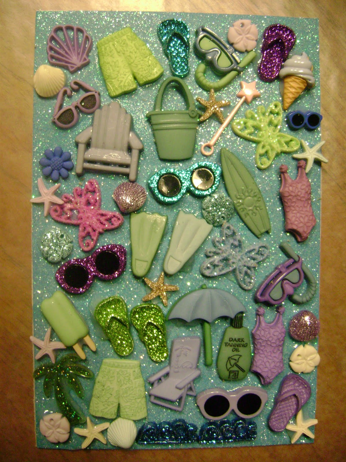 For Gretchen's inspiration card, I wanted to create something light, fun and very blingy!! I took turquoise glitter paper and embellished it with as many summer-related things I could find! Does this make you think of "The Season of Barefoot Approaching"?
Saturday, October 2, 2010
Free to Fly


 The book I am working in this month is entitled "Free to Fly." Two of the previous artists created spreads having to do with skydiving. As I am afraid of heights, I had no similar experience to share. Fortunately, a few of the prompts had to do travel, journey, escape. Since my husband and I just returned from a fabulous trip to Italy, I thought I would do something related to our recent travels.
Italy is half-way around the world from Hawaii. There is a 12-hour time difference. It took 36+ hours to get to our final destination, Bellagio. During our 10-day trip, we rode on planes, trains, automobiles, ferry boats and more. At last count, I came up with no less than 20 different modes of transportation! As a tribute to our journey, I created a flag pull-out to showcase each of them--including our tired feet!
I wanted to create a fresco-like textured background. I wrinkled wax paper and glued it to cardstock. I then smoothed and sanded the wax paper. I lightly inked the surface with an ink pad. On top of it, I wrote all of the different places we visited on our trip.
One last note, it's difficult to see it in these photos, but the edge of the pull-out is decorated with a piece of handmade paper (mustard yellow and cream colored) that I picked up at the paper shop in Venice claiming to be the oldest paper shop in the town!
Thursday, September 9, 2010
The Cupcake Chronicles


 When I first got Debbie's book entitled "The Cupcake Chronicles," I knew I wanted to do a pop-up cupcake. I read through Debbie's explanation of her book's theme, and began to get this idea of chronicling the evolution of the cupcake through the use of fashion trends. Don't ask me where that crazy idea came from...So, first there was the "caveman" cupcake, you know, Pebbles (the Flintstones), then I jumped a few thousand years to the 1950's with the iconic poodle skirt. This was followed by the 60's "hippie" look, the "disco" attire popular in the 70's and the "punk rock" fad of the 80's. For the piece de resistance, I created a blingy, but demure, cupcake in beautiful pink hues. The "pop-up" feature is made with parallel folds to create a tiered effect (think Beauty Pageant). I call my spread, "Evolution of the Cupcake."
Sunday, September 5, 2010
More Inspiration Cards
 Look what I have been busy making today! I was working on an inspiration card and decided to make one in the style of Kelly Rae Roberts. I didn't struggle as much with the faces this time, but I'm still not brave enough to draw open eyes. I just loved how it came out, so I made a similar one for myself.
Wednesday, September 1, 2010
Celebrating Nick Bantock
 Artwork from Nick Bantock
the creator of the Griffin and Sabine series
I am excited to tell you about a competition inspired by the father of mail art, Nick Bantock. Artists are invited to submit a piece in the style of Nick Bantock, creator of the Griffin & Sabine trilogy. The deadline for submission is December 1, 2010. There will be cash and prizes awarded to the top three entries. Photos of all works will be compiled into a beautiful book that will be available for purchase. Here is your chance to get published!
Sunday, August 29, 2010
Salad Mandala
 For my third Inspiration Card, I chose the prompt "an exquisitely made salad, delicious and healthy." It will be going to Clare, who makes the most lovely mandalas. I wanted to incorporate a mandala into my inspiration card for Clare. I found a mandala template that actually looked like a salad. From there, I decorated the mandala with pieces of crumpled tissue papers the colors of a fresh garden salad. Can you see the luscious red tomatoes and the juicy golden apple slices? I used four different colors of green for the lettuce. Thanks to Su for suggesting I add the fork and to my friend Michele, who suggested I put the salad onto a plate. I call it "Salad Mandala." Now doesn't it just look good enough to eat?
Monday, August 9, 2010
My Second Inspiration Card
 For my second Inspiration Card, I chose the prompt "A life ignited, burning and fueled by creative passion. I used red, orange and yellow cellophane to create the flames and then cut and glued words that for me, describe creating and making art.
Friday, August 6, 2010
Under the Sea


 The inspiration for my spread in Laura's AB entitled "The Sea," came from the Yahoo AlteredBooks group's August Challenge: "At the Beach" incorporating texture. I immediately knew that I wanted to do a colorful underwater coral reef. I used many different materials to create a variety of textures: peacock feathers to simulate sea grass, glitter and metallic paints, gold microbeadz for the starfish, assorted nail art embellishments to create the coral formations, flower stamens and irridescent glitter for the pink anemones and finally, a product called "Flower-Soft" to texturize the red coral tree. You can almost feel the texture--especially in the last photo. I just love how this turned out!!
Ingrid's Circle Book


 In our Honolulu AB RR, for each book we work in, we are asked to describe the technique we used. I went quite literal with Ingrid's Circle Book this month. I wanted to create a circle book for my spread. Since this is a 3-dimensional object, the challenge was to find a way to incorporate my "pop-up" circle book into Ingrid's loose-leaf, three-ring paged book.
First, I selected several different papers decorated with circles and ended up creating three separate circle books. I used four different patterns for each circle book (top photo). The circle books needed to be folded flat in order to be incorporated into the book. So, on the front of my page (third photo), I created three quarter-circle pockets to hold my folded circle books. On the back of my page (bottom photo), I made a quarter-circle pocket to hold the tutorial.
Wednesday, August 4, 2010
More Marie Madness: 4 x 4 Fat Book Pages


 At first I didn't think I would have the time to participate in this wonderful Marie Antoinette 4 x 4 fat book swap hosted by Janet. I certainly have an abundant stash of Marie-related stuff to use up and the thought of having a Marie fat book of my own was too tempting. So...I'm happy to say that I managed to find the time to make 6 pages for the swap. And for someone who was so short on time, I can't believe I chose to compose my pages with INCHIES! Do you know how many inchies there are on a 4 x 4 page? SIXTEEN! Multiply that by 6 and well, that's how many inchies I had to create. In the end, I over-calculated and ended up making more than I needed so I will have to come up with a clever way to use up the leftovers.
The six pages are basically the same with a few minor differences. On the back of each page, I stamped a chandelier. I can't wait to see the all of the other beautiful pages!
Sunday, July 25, 2010
Chris' Imaginary Vacation


Well what a fun theme this was! Chris' book is entitled "My Imaginary Vacation." While others dream of visiting France, Italy and the Mediterranean, my imaginary vacation involves lots of chocolate and Johnny Depp!
I started off with a scrumptuous chocolate truffle background. I decorated some of the truffles with irridescent glitter glue to make them look sugar-coated. Then behind some of the truffles, I created four Johnny Depp pull-outs. I added ribbons and beads to decorate the spine and my work was finished!
I started off with a scrumptuous chocolate truffle background. I decorated some of the truffles with irridescent glitter glue to make them look sugar-coated. Then behind some of the truffles, I created four Johnny Depp pull-outs. I added ribbons and beads to decorate the spine and my work was finished!
Friday, July 23, 2010
My First Inspiration Card
 For one of the swaps I am now involved in, we are to create a 4 x 6 card using one of 32 prompts for our inspiration. We only decorate the front side. There are 8 players, so every two weeks, I send one card to someone in the group. In return, I receive a card from a different player every two weeks!
This is my first card. My prompt is "Escaping Into A Good Book." I created this card the other night during an art play date with several friends. Su told me that she decided to create two identical cards--one for the swap and one to keep. At the end of the round, she will have twice as many cards! It was a great suggestion, so I also made two.
Monday, July 12, 2010
Lisa's Marie Antoinette Folder


 Our Marie Antoinette folder swap is winding down. The last folder I got to work in was Lisa's. Wow! By the time her folder arrived, it was bursting at the seams! Lisa didn't have a particular theme for her folder. I thought about using pretty soap and perfume labels. There were so many of them, it was difficult to decide which ones to use. I wanted to use them all.
That was when I decided to do a flag pull-out for Lisa's folder. A flag pull-out uses and accordian fold to display several tags (or flags). I covered each tag with a different soap or perfume label--24 in all! They were so colorful and each one a beautiful piece of art in itself. The flag pull-out adds an interactive and visually stunning feature to the spread.
When you first turn to my spread, the accordian folds are closed. To open the accordian fold, you pull the pink ribbon down. There are three accordian folds on each side. I placed images of Marie Antoinette on the background and the text reads "Dans la salle de bain, il y a beaucoup de savons et parfums."
Saturday, July 3, 2010
Sox's Nick Bantock AB


 I had the privilege of working in Sox's Nick Bantock AB this month (our Honolulu AB RR). I love Nick Bantock's stuff but never really studied him that closely--until now!
I painted my background in rich, Bantock-like colors. Added some strange images, a few postage stamps and a postcard (aged to perfection). I also had a handmade blank book that was decorated with beautiful, exotic postage stamps that fit perfectly with Sox's theme. I secured it into the center of my spread with a variety of orange fibers and beads. Turns out there are orange hues on the cover of the book, so they matched! For the post card stamp on the right side, I took an inspiration card that Sox recently created and reduced it to the size of a postage stamp!
Subscribe to:
Posts (Atom)