Saturday, December 8, 2018

Jester, Our Angel Dog


We had to say goodbye to our dear, sweet Jester boy last month.  It has been difficult adjusting to life without him.  His presence filled our lives for 12 wonderful years.  We are now left with only emptiness and deafening silence.  This month, my card honors his independent spirit. 

I chose one of my (many) favorite photos of Jester.  This was taken on the beach behind my parents home and it was a special place where he loved to play.  I love how this picture captures his regal, majestic stance.  

Since Jester has now crossed over the Rainbow Bridge and is in the company of angels, I decided to give him wings.  These wings were created by spraying a mist of water over the photo, laying a wing stencil down and using an awl to gently scratch the surface.  I think he wears his wings well.

Jester was a very special companion to all whose lives he touched.  He leaves a huge hole in our hearts but we take comfort knowing that his spirit is now happy, wild and free.

Friday, October 26, 2018

Explore (Chicago!)


I travelled to Chicago last month and the Windy City was all the inspiration I needed for this month's mindfulness card.

I met up with a friend from college who lives a few hours outside of Chicago and together we explored the City.  From the Riverwalk, the 
awe-inspiring Architecture Boat Tour (by night), Millenium Park, the "Bean," the Art Institute of Chicago, deep-dish pizza, Chicago hot dogs, Buckingham Fountain, the Sky Deck at the Willis (fka Sears) Tower, Stony Island Arts Bank and even walking two labyrinths--we did it all in just over two days.

I just knew that that I could share a lot of the sights of Chicago with this fun "napkin fold" pop-up card.  

Saturday, September 29, 2018

Respect


With the recent passing of the Queen of Soul, I decided to create my monthly Mindfulness Card by honoring Aretha Franklin.

I found a high contrast image of Aretha which I ran off on transparency.  I also wanted to use the "Respect" sheet music in my card.  I wasn't quite sure how these elements would all come together to create a 4 x 6 card, but over time--and after considering a few different ideas--I began to feel a 1960's vibe emerging.  After all, this image of Aretha is probably from the 1960's.  

The circle-patterned scrapbook paper really completed the look I was going for.  So instead of trying to incorporate the sheet music onto the front of my card, I used it to complete the back of the card. I found coordinating washi tape to bind all three layers--Aretha, scrapbook paper background and sheet music--together to create my card.

Saturday, September 8, 2018

Fun with Pink and Orange

I had fun creating my page for this month's color journal.  When I think of Pat, I think "fun," "playful" and "funky."  It's no wonder her colors are pink and orange!

I don't know why, but the other pages created for Pat's color journal seemed to all feature faces.  I did not intend to include a face in my page for her.  I actually wanted to incorporate Pat's own image into my pages.  To do this, I stalked her on Facebook!

Pat had a number of images that I could picture using in my pages.  I chose this one:

No automatic alt text available.

The first thing I did was to run off this image in black and white.


Next, I took white cardstock and colored it with pink and orange ink pads.  I then copied Pat's black and white image onto the colored cardstock.

Since she had used vintage Japanese newspaper for her background, I took Japanese text pages and colored them with Dylusion sprays in pinks and oranges.

I then cut out tresses of hair from the colorful text pages and re-imagined a new "do" for her image.  Pat usually wears hints of blues and purples in her hair, I gave her  pink and orange highlights for this spread. 


The Pat I know is not that recognizable to me in this image.  The Pat I know wears glasses, so I added glasses and now I see Pat!


Saturday, August 18, 2018

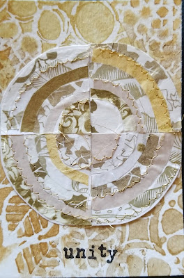
Unity


I had a lot of leftovers after working on the gold and cream color journal pages last month.  Since I had not yet started my mindfulness cards for August, I thought I would play a little bit more with Jane LaFazio's  "Recycled Circles."
When I was finished, I took a moment to study what I had created.  I love how the seemingly different pieces of tissue paper are united in harmony by the similar colors.  I love how the concentric arcs, though made up of separate bits and pieces, come together to form a complete whole, and I love how the stitches bind everything together into one cohesive circle.  All of this led me to this one word, "Unity."  


Wednesday, August 8, 2018

Life is a Circle


 The pages for this gold and white color journal were weeks in the making.  I was inspired by Jane LaFazio's Recycled Circles.  These circles are made with several different gold and white tissue papers I had in my stash.  
I started by creating a background on watercolor paper.  I used a variety of gold acrylic paints applied through a few of my favorite stencils.  I then cut the decorated sheet into 4" x 4" squares.
Next, I selected 8 different patterned tissues and cut them into 8" circles.  This way, the finished product would fit onto an 8" x 8" page (folded in the center).  I used binder clips to hold the stack of tissue papers together while I quartered the circles.
From there, I cut each quarter circle into half c-shapes in concentric circles.  I laid out the half c-shapes in decreasing size to decorate each of the 4" x 4" squares.  When I was happy with the design, I used a glue stick to hold the tissue papers in place.  
For added texture, I sewed some of the circle outlines by machine with gold thread.  I trimmed the excess tissue and thread for clean edges.
I mounted all four squares onto an 8" x 8" sheet of watercolor paper folded down the center and then added the "Life is a circle" quote around outer-most circle.


Saturday, August 4, 2018

2018 Summer Mail Art

Hot off the heels of my "Sacred Geometry" Mindfulness cards, I decided to also make these string art nautilus cards for the 2018 Summer Mail Art Swap.  I had wanted to join this annual swap last year, but did not have the time to make the commitment last year  I understand that some years they can have upwards of 20 people that join!  That's a lot of mail art!  Sign ups closed at the end of May and you have the months of June, July and August to make and send mail art to the participants.  So I made up my mind to sign up this year.


This is my well-worn template.


Eighteen.  Count them.  Eighteen.


Saturday, July 21, 2018

Speaking of Black Ice...


Since I had already been experimenting with Black Ice, I decided to make my July mindfulness cards using this technique.  Despite repeated tries, I still could not get my stamped images clear and crisp.  They looked blurry and the images were not always evenly stamped, leaving parts of the image lighter in some areas and darker in others.  Yet, the more I studied this stamped image, the more I discovered--sort of like hidden pictures.

Then it hit me.  The images I had created had a dream-like quality.  Images that appear in dreams are not always clear.  Some parts are more vivid than others.  And, the more you analyze your dreams, the clearer they become.  Did you notice the two deer in the foreground?  I didn't at first.  Did you see that she is holding a peach in her outstretched hand.  Me either, but now I see it.

*My black ice piece only measured 4 x 4", so I sandwiched it between two pieces of acetate and secured the corners with eyelets.  

Saturday, July 7, 2018

Black Ice


This is a technique that I've been seeing a lot on youtube.  It's called Black Ice and I finally had some time to give it a try.  It is a stamping technique created by Melissa Kerman.

Since I was just experimenting, I started with scrap silver foil cardstock.  You begin by taking an Archival or StazOn black inkpad and lightly dragging it from top to bottom over the foil cardstock.  Next, you stamp and image onto the cardstock with the Archival or StazOn black ink.  Dry with a heat tool.

The next step involves taking a Versa Watermark inkpad and ever so lightly dragging it from top to bottom of the foil cardstock.   Apply clear embossing powder to cover the cardstock and tap off the excess.  Use a heat tool to melt the embossing powder.  The end result creates an icy-like surface over your image.


Friday, July 6, 2018

Found Poetry


I have always been fascinated by the concept of found poetry.  I love the serendipitous nature of  stumbling across words and creating an entirely new and different story.  It also helps if you have some good text to start with otherwise, who knows what you might end up with, right?

For these gold and white color journal pages, I got out my stash of loose text pages (removed from various altered books over the years) and started glancing through the lines to see what popped out.  At the back of my mind, I knew I would be creating this poem for someone who had recently lost her husband.  I wanted the poem to acknowledge her loss but at the same time offer hope.

I'm not sure I could have planned this any better.  After discarding only a few pages, I settled on these two.  Here is the poem that emerged:

 You had a strange uneasiness.
You lose speed.  You sink--afraid you may drift like some cosmic accident that swallows you up.
In the heart of isolation, memories were invisible riches.
Marvel at the happiness!


I went to Pinterest to get ideas for how to block off the remaining text.  There are some really amazing found poetry pieces posted on Pinterest!  To bring the gold and white palette to my pages, I decided to block the remaining text by painting over the words with gold acrylic.  I actually like that you can still see the text beneath.

I mistakenly cut the pages too short and ended up having to mount them onto watercolor paper sized to 4" x 8".  Even though the watercolor paper was white (also part of the color palette), the contrast was too stark.  I took the leftover gold paint and played with mark-making.  These designs were made with a plastic cap and Q-tip.

Thursday, June 28, 2018

Sacred Geometry


I have wanted to do some string art for one of my mindfulness cards.  Traditionally, string art involves using nails to anchor the string.  In the setting of altered art, I usually use mini brads to anchor my string designs.  When I started exploring the idea of sacred geometry, I found this string art pattern for a chambered nautilus.  Since our mindfulness cards are only 4 x 6, the format is a bit small to use brads in place of the traditional nails for string art. That's when I decided I would just "embroider" the nautilus pattern onto my cards.

Here, I used 140 lb. watercolor paper for my substrate.  I scaled the pattern down to fit the 4 x 6 card and ran it off onto cardstock.  I laid the pattern over my card and used an awl to poke holes into the card.  I then chose gold metallic thread to "sew" my nautilus design.

In the beginning, it took me awhile to figure out the sewing pattern (plus my thread kept getting tangled!)  Once I was familiar with the sequence, the other cards were faster to make.  It still took about two hours to make each card, but the process was quite relaxing.

Friday, June 22, 2018

No Mud, No Lotus


When I saw this color palette of blues and pinks, I thought I would do this pop-up lotus flower.  I painted the background (140 lb. watercolor paper) with cerulean blue acrylic.  For the flower, I used ink pads and an ink blending tool to color sheets of vellum.  I followed this tutorial to make the flower:   http://www.instructables.com/id/Amazing-flower-pop-up-card./

I chose this quote from Thich Nhat Hanh which states "No mud, no lotus," and finished the edges by stamping with a mandala stamp.  I can't remember where I got the beaded dragonfly, but it complimented this page, so I put it on a gold cord and will include it when I send my page. 


Saturday, June 9, 2018

Turquoise, Teal and Olive


Another beautiful palette to explore this month!  The colors immediately brought to mind peacock feathers.  I debated whether to use actual peacock feathers in my spread but ultimately decided to use my peacock feather stencil.

I had fun pulling out all of the supplies that I had in these three colors to help me decide how to make my pages.  I had acrylic paints, glitter paints, embroidery floss, Glimmer Sprays, Dylusion Sprays, Distress Inks, glitter glues, Perfect Pearls, markers, gel pens, Inka Gold...dizzying, huh?

Next, I created several swatches to see which products gave me the truest colors.  I liked the look of the Blue Teal Glimmer Spray for the background.  On top of that, I added a light coat of Blue Ice Glimmer Spray for a little more shimmer.

I had not played with my Inka Gold in quite sometime.  In fact, I discovered that a few of my pots had dried out, so while I had them out, I sprayed some distilled water into the pots to moisten them back to a creamy consistency.  I pulled the Turquoise and Greenyellow (which looked more gold than olive green).  Since I did not have the Inka Gold in teal, I used a deep blue glitter paint instead.

When the feathers were done, I added a little bling for embellishment.  I chose this brief quote by Henri Matisse about creativity (probably because the recipient of these pages is a very accomplished artist which sort of intimidated me!)

I also made a peacock feather bookmark to compliment my pages.

Monday, June 4, 2018

Box o' Bliss


This month's Mindfulness cards are playful, tongue-in-cheek.  Although not a traditional mindfulness prompt, "Chocolate" made the list by popular vote.  I knew it was only a matter of time before I would tackle this prompt. 

I admit that I borrowed this idea from a spread I did in an altered book round robin several years ago.  That book's theme was "My Imaginary Vacation."  I envisioned my Imaginary Vacation to involve loads of decadent chocolates and Johnny Depp.

For these chocolate cards, I found an image of a box of chocolate truffles and cut them down to 4x6 size.  Through painstaking trial and error, I created a template for a 3-D looking box to house the truffles.  .


I had already asked my swap partners who their celebrity crushes were, so armed with this information, I scoured the internet for photos of their celebrity crushes.  Now, this is where the fun comes in.  I sized the heads of the various celebrity crushes to fit the chocolate truffles.  Then, I created pull-outs with their heads!


Johnny Depp still remains a celebrity crush of mine, but I had also had to include Pierce Brosnan in my Box o' Bliss!


Tuesday, May 15, 2018

Penny Leis for Graduation


It's graduation season again and in Hawaii, we honor our graduates by giving leis.  I have made various penny leis over the years.  The pink and iridescent cellophane lei in the top photos were made for a family friend graduating from college in Colorado.

The red and black cellophane lei in the middle is for my nephew who graduated from the University of Hawaii at Hilo.  Red and black are their school colors.

The red lei in the bottom photos is for my niece who is graduating from high school.  At her school, each class votes on a class color that will be associated with their class throughout high school.  Her class color is red.  Since she is petite-sized, I wanted to create a daintier lei that would not overpower her.  I experimented by making this lei with glittered tulle (3" x 3" squares).  I like the way it turned out.  The size turned out just perfect for her!

Saturday, May 12, 2018

Turquoise, Pink and Orange


I cycled through a lot of different ideas before I finally arrived at this page (above).  I love the color palette, so I was surprised and frustrated that I couldn't easily figure out what to do.  I think part of my struggle was that many of these color journal pages will be bound in a Midori style journal (elastic cord binding).  The size is 8 x 8 with a fold in the center.  This is a surprisingly small size for me and it required some scale adjustment on my part.  Also, some recipients want the work to be flat.  Talk about a challenge!  My style tends to be chunky, embellished, interactive.  I find that my "go-to" techniques often require the structure of  an actual bound book (which is why altered books really appeal to me!)  So, outside of my comfort zone I ventured.

The creative process began with this idea of Kandinsky-inspired circles.  I made a mock up out of concentric felt circles, but once I saw it, I wasn't loving it.


It took me a long time to reach the decision to abandon this initial idea and start anew.  So, once back to the drawing board, I began to make a connection between these colors and Bollywood.  This palette reminds me of India and knowing that Jen loves music, Bollywood seemed a logical choice.  Easy and inspiring, right?  Or so I thought. Beginning to feel the time crunch, I forced myself to just START.  While pulling stencils that gave me an "India" vibe, I thought I might try playing with these new layered stencils from Altenew (Dahlia).  Using Distress Stains, I chose orange for my background color. For the first stencil, I applied a pink Distress Stain with a felt applicator (I was too lazy to find my sponge daubers).  I applied a turquoise Distress Stain through the second stencil.  Some of the colors started to bleed into each other which gave it a soft, water-color effect.  I was fascinated by this layered technique.  This is how it turned out:


Interesting, but it didn't feel right for these color journal pages.

Next, I pulled out my Dylusions sprays and started playing with some of my other stencils.  This background was created with orange and pink Dylusion sprays.  I added another layer applying turquoise acrylic paint with various plastic lids and Q-tips.  I was happy with the bright and energetic look that was emerging.


As fun as this was, it really needed something more.  I toyed with the idea of adding silhouettes of Bollywood dancers.  Or a Buddha image.  Again, none of this was really grabbing me.  I think that's when I started to move toward a Boho page.  I imagined colorful ribbons decorating the page edges. 


 Yes!  But, it still needed a focal point.  I found a quote about music that seemed fitting.  I printed it out in a 3 x 3 square and framed it in turquoise paper (using my new Frame punch board from We R Memory Keepers).


Despite the early struggles, I am very happy with how this page turned out and think Jen will love it too!