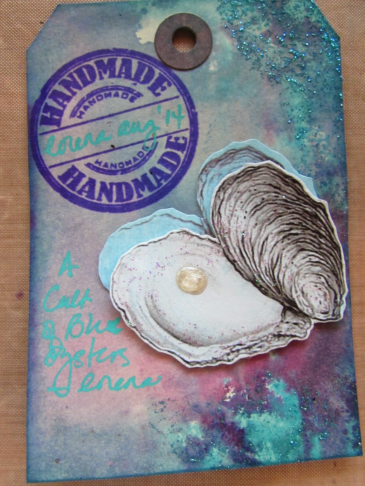
I have been busy preparing my book for a new AB RR that will begin next month. With a cover like this, how could I not pick a theme that had to do with COLOR? My book is all about getting you out of your color comfort zone. I call it the "Mystery Palette Challenge."
I started by decorating the inside covers (front and back) with literally hundreds of 1" squares punched out of paint chip samples.

Inside Front Cover
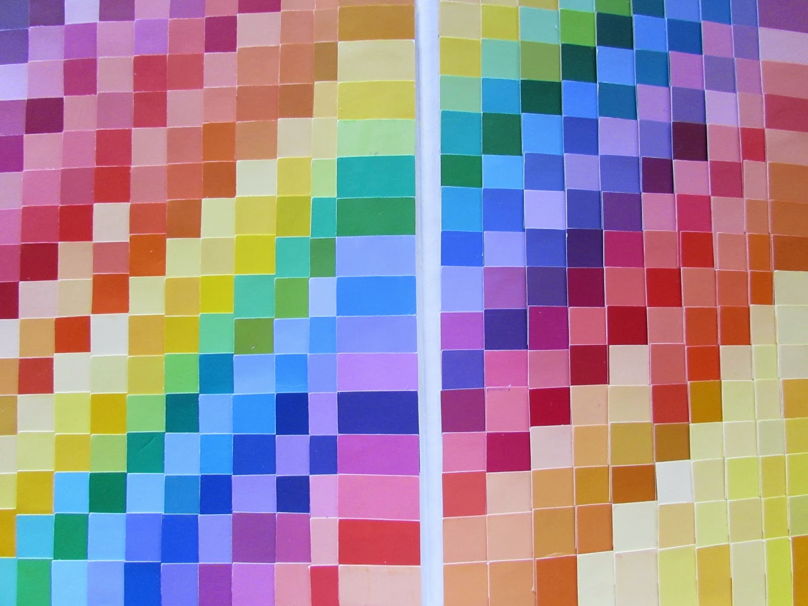
Inside Back Cover

Introduction Page

Instructions
The premise of my theme was inspired by the column entitled "With One Palette" featured in Somerset Studio Magazine. I started by gathering 20 different color palettes. Then, for each palette, I punched 1" squares for each color from my never-ending supply of paint chips, and placed them into mini envelopes. I sealed and numbered each envelope. Hence, the "mystery." The envelope will also serve as the artist's sign-in.

Flag Pull-Out With Envelopes Attached

I decided to display the mystery palette envelopes in a flag pull-out. Each envelope is attached with velcro which made the pull-out quite bulky. Instead of attaching it to the book at the start of the round, I decided to keep the flag pull-out separate and will attach it to the front of my book at the conclusion of this round.
Each player will select one envelope and the challenge is to create a spread using just the colors (all of them) in the palette they selected. For my initial spread, I chose the only palette that contained 5 colors. Here they are:


Now my book is just about ready to be placed into the rotation. I hope all of the artists will enjoy this Mystery Palette Challenge and maybe surprise themselves by creating beautiful works of art with a palette that is just a bit outside of their color comfort zone!