Saturday, February 22, 2014

The Moon and the Madonna...


What an intriguing book theme...the Moon and the Madonna.  It conjures up visions of religious icons.  Indeed, the previous work in this book centered around this type of imagery.

Being a Moon Child, I was more drawn to the "moon" part of the theme.  In a previous moon-themed book, I had played with the texture of heated Tyvek to create the lunar surface.  I didn't want to repeat that here.  

I remembered a day back in September when a few art friends and I got together and played with Citrasolv.  We took National Geographic pages and saturated them with the solvent.  In time, our pages morphed into glorious cosmic backgrounds.  I pulled out the pages I had made and found a set that reminded me of Carl Sagan's Cosmos.  It would serve as the perfect "universe" upon which I would place my moon.

But what to do with the moon?  I thought of the Man in the Moon and that led me to picture Madonna in the Moon.   For some reason, I thought of the iconic image of Cher in the Moonstruck movie poster.  Cher in the Moon.

For fun, I created a "flip" moon page so I could feature both Madonna in the Moon as well as Cher in the Moon.  So here it is--a fresh take on the Moon and the Madonna theme.  What do you think?  

Friday, February 21, 2014

Four Quarters Page Challenge


Here is my piece for the February page challenge in the on-line Altered Book class I am taking.  I was surprised at how long it took me to #1 find an image that I wanted to work with and #2 gather the proper design elements for the challenge.  Images were either too big or too small.  I didn't have the right color or pattern tissue paper.  After pouring through too many magazines to count, I finally came across this image of Marilyn Monroe in a NYC gallery guide a friend had given to me and decided to build my challenge page around her photo.

I gessoed my pages and painted them white.  I placed torn pieces of black and white damask patterned tissue paper in diagonally opposing corners.  I temporarily placed Marilyn in the lower left hand quarter as I played with the rest of my layout.  Initially, I was going to use a luscious red satin ribbon to frame my page, but it was too wide and ultimately too “heavy” for this page.  After some digging (more like excavation) I found this rhinestone trim which I was able to cut down to the perfect width.  I used two strips along the top and bottom to frame my piece.

By now, I was happy with where I had originally placed Marilyn’s photo,  I put the image on white cardstock and gave it a small margin which made it look like an old black and white photo.  I secured the bottom with double-stick tape and used foam mounting strips for the top of the photo for added dimension.

For my text, I wanted to experiment with the re-positional nature of placing text onto deli paper and using it as a collage element.  Since I didn’t have any deli paper, I printed my text onto tracing paper.  I chose a font that went with the overall feel of the page—romantic, dreamy, classic.  I placed the text in the remaining quarter and affixed it with liquid matte medium.


For that something extra to tie everything together, I gave Marilyn a diamond necklace and bracelet (Swarovski crystals).  I used a rhinestone flourish to connect the photo to the text.  I couldn’t resist adding a red lipstick kiss (sticker) for a punch of color.


Tuesday, February 18, 2014

Chunkies Are Back!


After a brief hiatus, I am happy to announce that chunkies are back!  To get us started, our theme for February was Valentines, Hearts & Love.  

I decided to use up some of the text pages that I have removed to thin out several of my altered books.  I took out my Big Shot and started making lots and lots of heart shapes.  I took seven hearts and folded them in half to create a 3-D heart.  I secured four of these 3-D hearts to each of my chunky pages with brads.  I added just a hint of color to the edges of my hearts with an inkpad.  Of course, my pages would not be complete without a little bling or hardware, right?  So, I selected a heart-shaped charm which I suspended on a chain anchored between two of the hearts. 

Sunday, February 16, 2014

A Sunday Spent Boiling Books

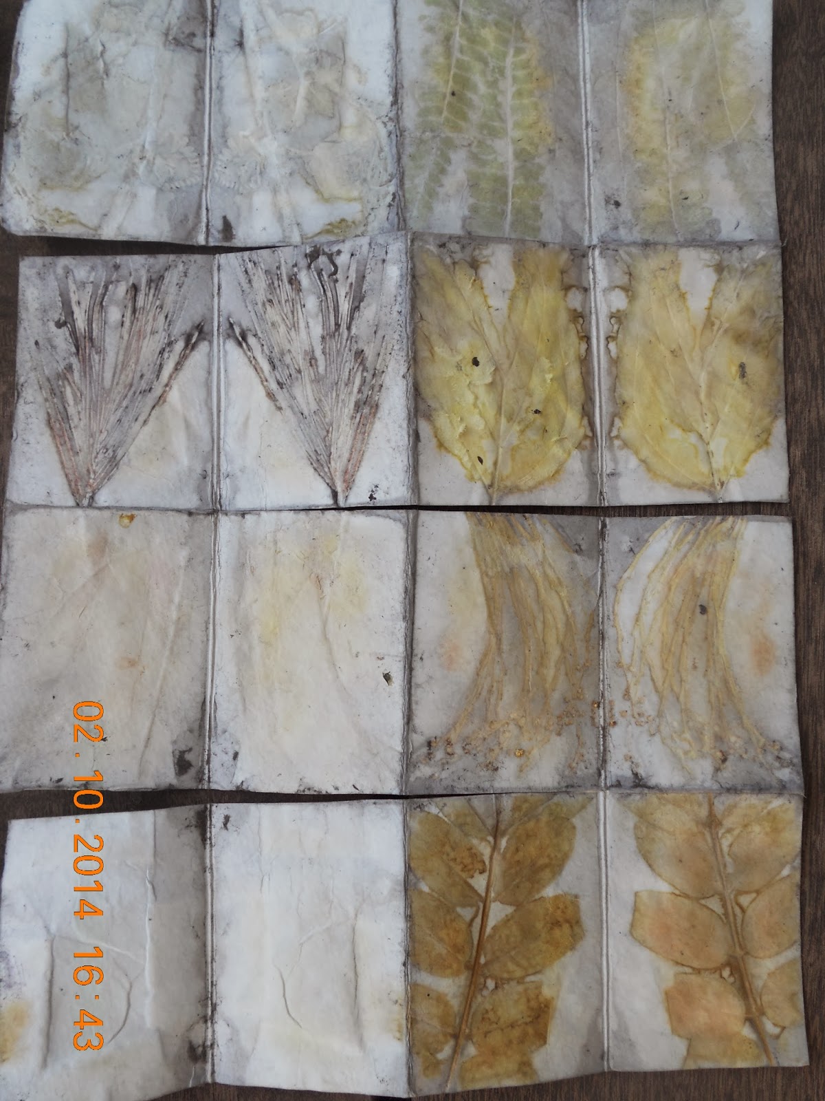
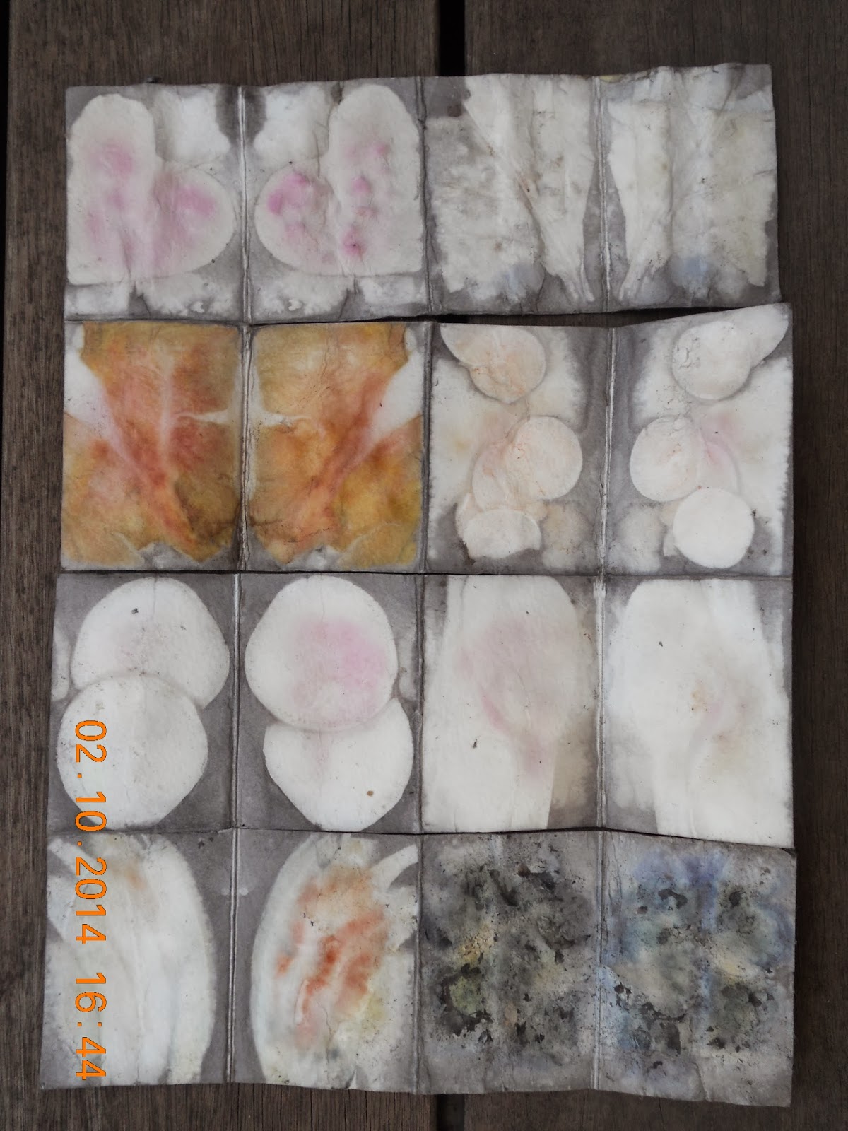
Last weekend, I spent the day with art friends making two batches of boiled books. We each gathered and brought plant material to share.  We even had a food section that included carrot, sweet potato, beets, baby bok choy, red onion, yellow onion skins, blueberries and pomegranate!


Opening your books after boiling is a lot like Christmas because with this process, you never quite know what plant material will leave color or texture.  


This is how my four books turned out
(front and back):


I just love how the color and texture came out on some of the pages:


I started making covers for my boiled books.  The two on the left are covered with distressed looking scrapbook paper.  The two on the right are covered with handmade papers that I embossed. 


I used the Artistcellar "Seafoam" stencil to emboss the brown cover on the left.  I used an embossing folder to emboss the green cover on the right.