Thursday, July 9, 2015

Faerie Folk


I have not been arting as much lately and I was feeling a bit rusty as I sat down to work in Sue's "Faerie Folk" book this month.  I went through so many different ideas of what to do for Sue.  She likes dark themes (her instructions say "No Disney please"), so I wanted to feature a nymph or fairy that was more mysterious, haunting.

The other thing I did was to take Sue's name and run it through the Fairy Name Generator.  This is an on-line tool that creates your very own personalized fairy name.  Sue's name was Briar Beamfrost.  I immediately liked the images that this name brought to my mind.

I found this ethereal image of a fairy and knew she would be the perfect Briar Beamfrost!  When I found her, she only had one set of wings.  I had to fix that.  For my spread, I gave her four sets of transparent periwinkle wings!  Can a fairy ever have too many wings?

I chose to copy the image onto vellum before placing it into her book.  I love how the text shows through yet doesn't detract from the image.  My extra sets of wings are also printed and cut out from vellum to create a 3-D effect.  Glitter glue painted onto the vellum wings was the perfect addition.  I think her wings look so real--almost like a dragonfly! 

Friday, June 12, 2015

High Rise Adventures


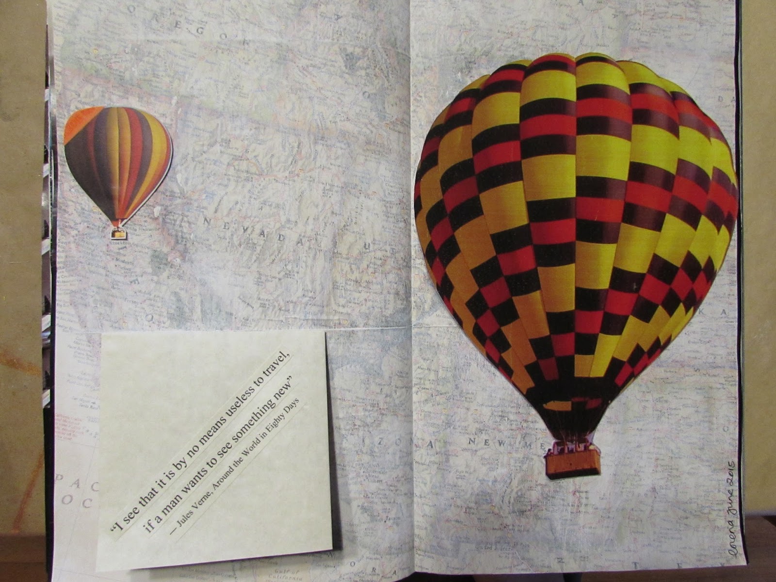
When I first saw Darrell's "High Rise Adventures" book I was excited to work in the vertical format.  We had recently returned from a trip to wine country where we went on a hot air balloon ride.  That would be the inspiration for my pages in his book.

I took my first hot air balloon ride over twenty years ago in New Mexico.  Even though I am afraid of heights, I enjoyed the balloon ride.  The fact that we reached heights of 1500 feet did not really alarm me.  i was much more taken by how peaceful the ride is--once you get used to the deafening sound of the burners.  Since then, despite my on-going fear of heights, I have taken two flights in Napa Valley.
For my background, I used a map which I muted with gesso.  To honor my inaugural flight, I positioned the large balloon to take off from Albuquerque, New Mexico (revealing a picture taken on our recent balloon ride) and the smaller balloon originates in Napa.  I used a penny slide mechanism to mimic the movement of a balloon--up and across the page.

To complete this page, I gathered a few "fun facts" about hot air balloons which I thought Darrell would enjoy.  The page pops open to reveal the list of fun facts.    

Wednesday, May 20, 2015

Man in Black


Lately, I have been absolutely obsessed with the "Serial" podcast.  I am a huge fan of true crime stories so when a friend first told me about it a few months ago, I just had to check it out.  This was the first season of Serial (which originally aired in the Fall of 2014).  Over the course of 12 episodes, reporter Sarah Koenig delves into the police files and trial transcripts, re-interviews witnesses to try to find out who killed Hae Min Lee.  Hae was a 17 year old high school student in Baltimore, Maryland.  She disappeared on January 13, 1999 and her body was discovered in a shallow grave a few weeks later.  Her ex-boyfriend, Adnan Syed, was tried and convicted of her murder.  He is currently serving a life sentence, but did they convict the wrong man?

My original idea for Hope's "Man in Black" book was to use a black silhouette of a man to raise the question, "Who Killed Hae?"  This idea morphed into the pages you see above.  I rifled through my stash of citrasolv pages and initially found an image of a man in a black hoodie.  I planned to use his obscured face--more his outline--for my man in black.  I wanted to trace the outline of his body by tearing the page edge.  Then when you turn the page, you see a picture of Adnan's face.  The picture of the guy in the hoodie was not matching up with the picture I had of Adnan., so I abandoned it.  To my surprise, when I tore the citrasolv background page to trace the shape of Adnan's body, I could see an image of the back of a man.  Can you see it in the top photo?  It could almost be Adnan's back.  His head...his hair line...the back of his neck...the outline of the shoulder...I must say, I love it when things like this happen in my artwork!   

For the rest of my spread, I cut out the letters for the Serial podcast logo, added some blood splatter with red acrylic paint and a little "crime" scene tape.  When you turn the page, you see Adnan and on the opposite page, there is an old picture of Hae Min Lee.  I stamped text onto deli paper and adhered it to the page with matte gel medium.  I wasn't sure if the stamped text would show up on the citrasolv background, but when I applied the matte medium onto the citrasolv surface, it began to bleach out the area.  This created a cleaner background for my text which made it much more visible.  

Sunday, May 3, 2015

Encyclopaedia Britannia


I was the last one to work in Amy's book for this Altered Book Round Robin.  When I received the book, I was astounded at all of the amazing spreads that the artists before me had contributed to this book!  It had me quite stumped for some time to come up with an idea that had not already been done and what technique I would use...

I thought about doing something on the crown jewels but could not find the components to put together a spread that I was happy with. I considered a spread showcasing the Jaguar, Britain's luxury car (my hubby's favorite!)...I even thought about doing something in honor of the new Princess of Cambridge recently born to Prince William and Kate, but none of those ideas were giving me a clear vision.

Then I started going through my travel files.  We had visited London (Ireland and Scotland) back in 2009 and I gathered lots of ephemera on that trip.  I wondered if any of it would spark an idea for my spread.  To my surprise, I had collected lots of postcards with typical London scenes.  Then it came to me, I would do a flag pull-out to show off London's famous landmarks.

I started with an extended accordion fold to serve as the base of my pull-out.  I then cut the postcards down to 4" x 1 1/2" sized flags and made them two-sided.  I affixed a total of 35 flags to the accordion base to create my flag pull-out.

I discovered a beautiful London-themed scrapbook page and decided it would make a nice background for the accordion pull-out.  I anchored the base of the accordion by cutting a slit in the left side page and secured it with tape before gluing the adjacent page to the back.  Next, I had to fashion a pull device for the accordion.  After surveying my stash of ribbons, I selected a gold cord and made a tassel from it.  For a finishing touch, I added a fleur-de-lis charm to the tassel.

In the top picture, you can see who the accordion fold sits flat when the book is in the closed position.  Once opened, you can use the tassel to pull the accordion open to the right to reveal the 35 flags with London sights. 

Tuesday, April 28, 2015

It's About Time


I had the inspiration for Lorraine's "It's About Time" book long before I got the book in my hands.  Spencer Day sings this song (I think it's titled "Till You Come to Me") on his Vagabond CD.  There is a line that says" "and the clock says that I'm half past losing my mind."  I love this visual.

How perfect that I found an image of a person holding their head in their hands in frustration but the head is missing.  All you see are the hands cupped about where the head should be.  I then found a beautiful image of the insides of a Mont Blanc watch in a catalog.  I substituted this image for the person's head.

Now to add some drama to my spread, I created a pop-up.  This is a V-fold pop-up technique that I learned from my friend Pam in a workshop she did a few years back.  I like how this pop-up mechanism doesn't flap up and out when you open the book.  The movement of this pop-up is subtle and vertical.  It may be hard to see this in these pictures.

The other thing I like about this V-fold pop-up mechanism is that you can add a background to compliment the moving part.  In this case, I used an enlarged picture of a watch face (in keeping with Lorraine's theme).  I added more height by building up the back layer above the top border of the book.  And, since I still hate my handwriting, I used little self-adhesive letters to spell out the line from the song.  I think it turned out really cool!  

Wednesday, April 15, 2015

Opiate for the Masses


I just LOVE the theme of Sophia's book:  "Opiate for the Masses."  So, call it inspired, but I've already finished my spread in her book!  I originally wanted to do a spread on Reality TV but Su beat me to it!  So my next idea was to pay tribute to those mind-numbing video games.  Seems everywhere I look, people are playing games on their phones.  Remember Angry Birds?  I have to admit, I am a fan of Candy Crush Saga (though I have been stuck on level 70 forEVER!)  According to my hairdresser, the latest craze is a game called Tsum Tsum.  But it was Bejeweled that first got me addicted to this past time and that is where the inspiration for my pages in Sophia's book came from!

I used highlighters to create the colorburst background.  I gathered up a handful of  acrylic "jewels" and started gluing them onto the page.  The title page is also "bejeweled" and further embellished with glitter glue.  Voila!  An homage to one of America's favorite past times, video games! 

Sunday, April 12, 2015

Artists' Quotes on Art


Colleen's book is all about artists' quotes about art.  Much of the artwork that preceded me were spreads done in the style of the artist whose quote was featured.  Although not a requirement, I found myself gravitating toward doing the same type of layout.  

Perhaps I was influenced by the Ai Weiwei spread that Colleen had done in her own book.  I was drawn to the urban, industrial vibe.  It immediately brought to mind the graffitt art of the elusive Banksy.  I searched his many quotes and found one that resonated with me:

"Art should comfort the disturbed and disturb the comfortable."

I chose this silhouette of a boy (holding a bouquet of flowers) and girl (holding a baseball bat) and showcased them against an urban wall--much like Banksy's canvas.  (I even included a drain pipe as he sometimes does). I created this background using a pulled paper technique.   This techniques reminds me of brick or concrete walls where bills and posters are repeatedly posted and removed leaving paper remnants.  I then printed the quote onto acetate and cut out a window to display the words.