Tuesday, June 25, 2013

The Land of Rainbows


I decided to play with contact paper for my spread in Lorraine's "Colors of the Rainbow" book--and glitter. Lots and lots of glitter.  Call me crazy.

I began with a cut-out arc for my rainbow.  It was tricky gluing the back of the contact paper to the cut out page and then trying to control these seven segments of different colored glitter without getting it all over the sticky side of the page.  It was too challenging to evenly divide the arc into seven equal sections, so I simply eyeballed it.  I figured when you look at a rainbow, the colors sort of melt into each other.  My rainbow sort of resembles that.  I was surprised how festive it turned out.  That glitter was even more sparkly than I realized!

This spread was created as the ideas flowed out of me.  It was not by any means a well-planned, thought-out and executed spread.  I usually have an idea to start, but I kept adding to this spread little by little until at last it was done.

   Ok, so what next?  This spread needed something.  I added the words of a popular local song "where I live...there are rainbows."   Still not quite done.  I have always liked the look of a cut-out page edge.  I took a punch that reminded me of a cloud shape and created a border that mimics that shape.

But it still didn't feel done.  So I asked, what makes rainbows?  The sun shining through the raindrops!  So there was my idea to create a sun shining behind the rainbow.  I used the same technique to cut out a sun and its rays on the pages behind the rainbow pages.  I took lemon-yellow glitter and carefully sandwiched it between two sheets of contact paper.

The finishing touch (of course) was the raindrops.  I realized I could not use the same contact paper technique to created the raindrops of the left side of the page because I had already glued that page together.  Fortunately, I had these turquoise blue metal raindrops which I sprinkled over the page.

Friday, June 21, 2013

Napkin Transfer Wine Collars


The idea for making these napkin transfer wine collars came to me when I was trying to figure out a birthday gift to make for a friend that lives part-time in France--at least she would be in France for her birthday.  I wanted something that would survive the journey halfway around the world and not be too costly to mail.
These handmade wine collars fit the bill perfectly.  Who in France doesn't like their wine?

I took 140 lb. watercolor paper and adhered a single-ply floral napkin with some watered down Elmer's glue.  I added a layer of clear gloss glaze which will help them repel moisture.  Since these wine collars are intended to mark each person's glass, they each had to be different, so I used 6 different floral napkins.

I used a circle cutter to cut out 3" circles (the size of a standard wine glass base).  I made a straight slit to the center and then cut a 5/8" hole in the middle of each disc for the wine stem.  Would have been nice to have a hole punch to do this but the reach was not far enough.

I was able to get 9 discs out of each sheet of watercolor paper which will make a total of 9 sets (of 6) wine collars!

Steampunk Pam


I gotta say I am thoroughly enjoying this hybrid chunky page round!  However, I am finding that having a full month to create a single page is too much time, so I end up working ahead.  My page for Pam's Steampunk chunky is not due until August 1, but what can I say?  I was inspired!

At my request, Pam provided me with a photo of her that I could use in my page.  I brought out all of my steampunk embellishments and this is what I ended up with.  I gave her cool glasses and a top hat to die for! Ok, so the hat is a bit bigger than the 4" x 4" page, but who cares?  This was such a fun page to create!

Monday, June 17, 2013

Murder Most Foul


I am working in Mari's "Murder Most Foul" book for Lori this month.  Again, I went with the Victorian angle  and decided to do a spread on Lizzie Borden.  This was the crime of the century.  Even by today's standards, this double murder was quite sensational for its day.

I took various images of the Borden home, her father, Andrew Jackson Borden and stepmother, Sarah Anthony Borden, crime scene photos, headlines from the trial and the courtroom, Lizzie and the infamous axe and printed these onto transparencies.  They are secured with eyelets.  I added the haunting words of the children's nursery rhyme under Lizzie's portrait.  I used handmade washi tape to frame her portrait.  Another strip of handmade washi tape completes the border on the left side of the spread.

Childhood Memories


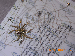
Lori's book is all about "Childhood Memories."  I had many different ideas for the spread I would create for this book.  Knowing that Lori is fond of everything Victorian, I used a poem written by Mary Howitt (1799-1888) entitled "The Spider and the Fly."

When I was a little girl, my mother would encourage my brother and me to memorize poems.  This was probably my first introduction to the great poets like Edgar Allan Poe, Henry Wadsworth Longfellow, Ralph Waldo Emerson, Robert Frost, Emily Dickinson, Joyce Kilmer, Henry David Thoreau and Walt Whitman.

Of all the poems that I memorized back then, my favorite is "The Spider and the Fly."  I love the cadence of the verse, the story it weaves and the poem's timeless message.  After nearly 40 years, do you know that I can still recite this poem from memory?  I have my mother to thank for that!

The poem talks about a cunning spider who attempts to lure this unsuspecting fly into his web.  At first, the fly is cautious and resists the spider's tactics.  Ultimately, the fly's vanity is her demise as she unknowingly falls victim to the spider's flattery.

For my background, I used scrapbook paper that resembled the wallpaper you might find in one's "parlour." I printed the poem out onto vellum and attached it to the background paper with eyelets.  Then I made a spiderweb out of fine string and secured it in the upper corner of the right side of the page.  I used a gold toned spider from a piece of costume jewelry that I had.  It was the perfect size!  I made the fly using a sized-down image printed onto transparency.


Sunday, June 16, 2013

Chunkies Continue With A Twist


Some of us are die-hard chunky page fans.  So, while the Sketchbook chunkies take a break, a few of us decided to continue a modified chunky swap.  The format remains a 4" x 4" page, but the rotation is like an altered book round robin.  Each player selects a theme for their own chunky book and each month a different player is assigned to create a 4" x 4" page for that book.  In the end, everyone will have a page from every other player.  

Bea's theme is "Fear" and she invited each of us to explore one of our own fears.  I have done a few fear-themed spreads in the past (fear of temptation, fear of heights, etc).  What would I do this time?  Well, believe it or not, the idea I got for Bea's page came to me in a dream.  I had recently purchased these animal print rolls of duct tape.  I got one orange giraffe print and one snake print.  Of course!  I could use the snake print duct tape and make a page on my fear of snakes!  Brilliant!

Fresh off my pop-up spiral tornado (for the Wicked book), I again created a spiral using the snake print duct tape to resemble a coiled snake.  I added the forked tongue and two beady little eyes and voila!  There was my snake.  Until I started to make this page, I did not know what the technical name of this phobia was.  The fear of snakes is called ophidiophobia.

Tuesday, June 4, 2013

Inspired by "1000 Journals"


During her recent visit, my friend and fellow Altered Lady, Pat, passed along an art journal that she had received as an alumna of Art Camp for Women (run by my fellow Sketchbook sister, Lori!)  This Art Camp Journal was inspired by the movie "1000 Journals."  The introduction in this journal (#1134) says "we got excited about creating art communities around every woman who has attended Art Camp.  One thing that all alumni report back to us about Camp is how much they enjoyed the camaraderie of other women artists.  The Art Camp Journal Project helps you create a little "art camp" where you live by sharing the journal with family and friends - supporting you and your art between Camps."  Isn't that wonderful?

Pat started this journal by creating 2 spreads.  Then she passed it on to me to add another spread or two.  I will pass the journal on to another person after I finish working in it.  When the pages of the journal are full, they ask that the journal be brought back or mailed back to Art Camp.  In the meantime, each artist is invited to send photos of their pages to be uploaded onto Art Camp's blog (www.artcampforwomen.com/blog).   How fun is that?

I always find that blank page is so much more intimidating (to begin) to work on than the pages of an altered book.  My spread began with a choice of colors that I wanted to work with.  I went with bold, strong colors--red and black.  I took out my Jill Berry-designed "Rivermap" stencil from Artistcellar (thank you, Lisa!) and LOVED the look of the design in these colors!  I decided to use a pulled paper background technique (gluing strips of a Japanese language newspaper to the page and later peeling it off).  I then stamped "venture to play" onto the background.

Saturday, June 1, 2013

Wicked Redux


Wicked has certainly been a popular theme in altered art and mixed media projects (much like Alice in Wonderland) since the debut of the musical.  I had another opportunity to work in a Wicked-themed book this month.  The challenge for me was how to keep it fresh.

So, I'm at a church rummage sale and I'm rummaging through the piles and piles of clothing and what to my wondering eyes do I see?  I almost can't believe it myself!  It's a black tee shirt with a screen print of an old barn on a farm.  You see where this is going, don't you?  

I couldn't imagine my fortune when I realized that the image on the tee shirt was approximately the same size as my spread in the Wicked book.  Now the cogs of my brain start to turn...I had been browsing through some of my altered art technique books for fresh ideas for a few of the projects that I have coming up.  One of the ones that caught my eye was a spiral "pop-up."  I had seen these before in handmade cards and always wanted to use this technique in my work somehow.  Aha!  This pop-up spiral could resemble a tornado.  Yes, a Kansas tornado!  Now do you see where I'm going with this thought?

I created a prototype to figure out the right size and proportion for my spread given the tee-shirt background.  And just to test it out, I asked my husband to see if my pop-up spiral created the illusion I was going for. My husband was born and raised in Kansas (which may have worked to my advantage).  He immediately recognized my crude spiral as a tornado.

I wrestled with how to attach a cut tee shirt image to a book's pages.  I decided that I would place two pieces of felt as a backing and blanket stitch the edges all the way around.  I ended up creating sort of a book cover or jacket that I could slip the pages of the book into anchoring my tee shirt background.  It gave the edges a nice finished look.  I was really liking how this was turning out!

Next, I created my pop-up spiral which is just 1/2" wide spiral cut from a 6" circle.  I used glue dots which adhered the cardstock spiral to the tee shirt better than I thought they would.  The mechanism worked beautifully, but my tornado seemed a bit sad.  It was a little too thin to be the menacing tornado we see in the Wizard of Oz.  So I got this idea to create two spirals going in opposite directions interlocking.  This gave my tornado a bit more substance.  I just had to be careful that the two interlocking spirals would still be able to lay flat so the book could close.  With some coaxing, it worked.

While I was happy with the way my spread was coming along, something was still missing and it wasn't the ruby slippers.  I toyed with the idea of writing in the sky "Surrender Dorothy" or the "Hate Kansas. Taking the dog. Love, Dorothy" or the "Hate Oz. Took the shoes. Find your own way home. Love, Toto"  but none of these was just right.  Since this spread is in black and white, what it really needed was a silhouette of Miss Gulch (aka the Wicked Witch of the West) riding her bike.  In the end, I settled for the silhouette of a witch riding her broom across the Kansas sky.